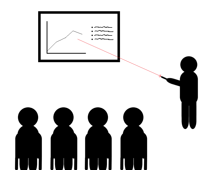
Presentations
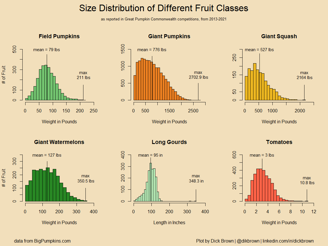
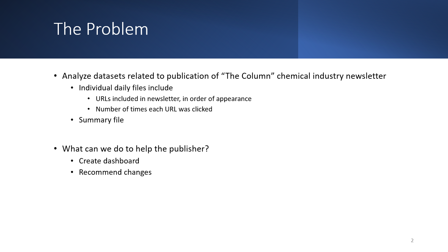
In Avery Smith's Hackathon, we were supplied with a real dataset from one of his clients, which included data related to publication of an e-mail newsletter. The data covered about a year and a half of publication. The data included link files for each day of publication, with a list of links in the newsletter, and the number of clicks it had. A summary file was also included, which contained the exact time of publication, the number of people it was sent to via email, the number of times each email was opened, the total number of clicks from the email, the number of "unsubscribes" from that day's newsletter, and the word and link count in the email. Two calculated fields were also included: open rate and click rate.
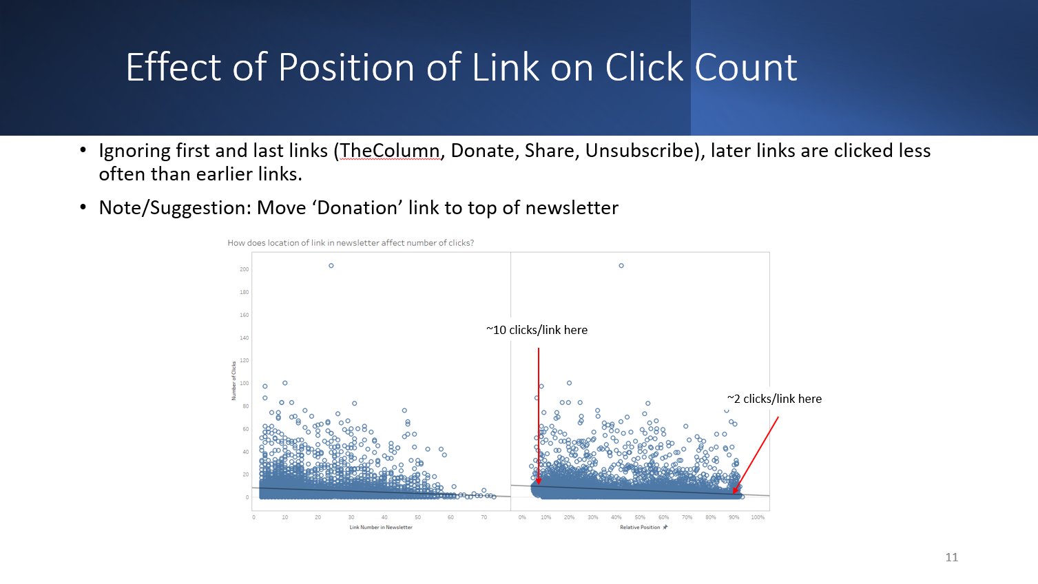
I used R for data wrangling. First, I combined all of the individual link files into a single file. I also pulled out the index of the last link in each newsletter. By doing this, I could calculate relative link position within the newsletter. The R code can be found on my Github.
I also used Tableau to create the storyboard, with input from the rest of the team. There was a lot of back and forth here, as we decided on what worked and what didn't. The storyboard is available at Tableau Public.
The presentation was a group effort, where we all participated in creating it. Everybody gave good input. Some of the best ideas were to a) include a "problem" slide, and b) keep the main presentation short and sweet, with extra information tacked on for those who wished to review it. I think these two things were big contributors to our first-place finish. I think the other reason was our analysis of the unreliability of the click counts.
An animated gif file is included to show the entire presentation.
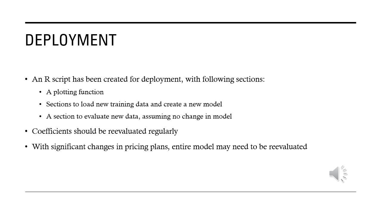
For my capstone project at SNHU, I decided to work with a dataset to predict customer revenue. As part of this capstone, I was tasked with creating a presentation of results. I have included three of the individual slides here, along with an animated gif of the entire presentation. Some screenshots of the machine learning aspects of the project are also included on the Machine Learning page of this website. The full presentation and report are available if you would like to see more.
An animated gif file is included to show the entire presentation.


Drop me a line and we can talk. It can be about a job, or a discussion of the website, or just the start of a beautiful friendship.